Phreesia Self-Scheduling
Phreesia Self-Scheduling
Phreesia Self-Scheduling
Phreesia Self-Scheduling
Overview
What should have been a quick, intuitive scheduling experience had instead become confusing and frustrating for patients using Phreesia’s self-scheduling tool.
What should have been a quick, intuitive scheduling experience had instead become confusing and frustrating for patients using Phreesia’s self-scheduling tool.
Here's how I led the redesign of Phreesia’s self-scheduling tool between August and November 2024.
Here's how I led the redesign of Phreesia’s self-scheduling tool between August and November 2024.
To comply with Phreesia privacy agreement, some details have been removed, anonymized, or altered. All work shown is my own and may not necessarily reflect the views of Phreesia.
To comply with Phreesia privacy agreement, some details have been removed, anonymized, or altered. All work shown is my own and may not necessarily reflect the views of Phreesia.
I was brought onto the LivNao team as the sole product designer and tasked to lead the design for their core mobile app. I dove into the mobile mental health world to help identify how to best address the future of mental wellness through the lens of LivNao.
Project Details
Roles: Planning, Strategy, User Interviews, Design, Iteration, Usability Testing
Roles: Planning, Strategy, User Interviews, Design, Iteration, Usability Testing
Tools: Figma, UserZoom
Tools: Figma, UserZoom
Collaborators: PM, UX Director, Software Developers + Architect
Collaborators: PM, UX Director, Software Developers + Architect
THE PROBLEM
AN EXPERIENCE LEFT BEHIND
AN EXPERIENCE LEFT BEHIND
AN EXPERIENCE LEFT BEHIND
Phreesia’s online self-scheduling tool had been left behind. Over time, its aging legacy designs created friction that negatively impacts both patients and practices. What was meant to be a selling point for new clients became a source of frustration leading to patient drop-offs.
THE GOAL
INCREASE SCHEDULE COMPLETIONS
INCREASE SCHEDULE COMPLETIONS
INCREASE SCHEDULE COMPLETIONS
My goal was simple - reduce patient drop-off rates while increasing schedule completions. This had to be done as quickly and efficiently as possible. We wanted to put Phreesia self-scheduling back on the map for our practices.
My goal was simple - reduce patient drop-off rates while increasing schedule completions. This had to be done as quickly and efficiently as possible. We wanted to put Phreesia self-scheduling back on the map for our practices.
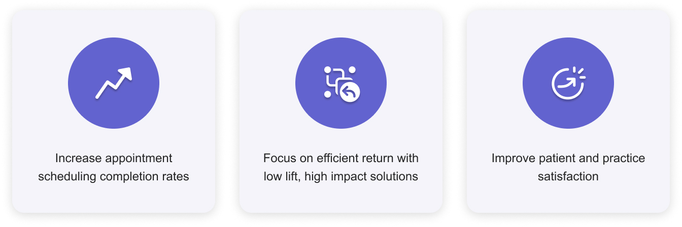
Our high level goals were to:
Our high level goals were to:
DESIGN CHALLENGE
"How might we streamline the self-scheduling workflow to reduce friction and improve scheduling rates?
"How might we streamline the self-scheduling workflow to reduce friction and improve scheduling rates?
"How might we streamline the self-scheduling workflow to reduce friction and improve scheduling rates?
"How might we streamline the self-scheduling workflow to reduce friction and improve scheduling rates?"
THE RESEARCH
UNDERSTANDING THE STATUS QUO
UNDERSTANDING THE STATUS QUO
UNDERSTANDING THE STATUS QUO
Working closely with the PM, I conducted an in-depth dive on the current state of the product.
Working closely with the PM, we conducted an in-depth dive on the current state of the product.
Working closely with the PM, I conducted an in-depth dive on the current state of the product.
Identifying Core Drop-Off Areas
We kick-off our discovery by using our internal analytics tool to break down the self-scheduling workflow and identify where patients were abandoning the flow at the highest rates. From there, I partnered closely with our PM to review the data, align on problem areas, and prioritize our roadmap.
Together, we prioritized the main focus areas based on:
We kicked off our discovery by using our internal analytics tool to break down the self-scheduling workflow and identify where patients were abandoning the flow at the highest rates. From there, I partnered closely with our PM to review the data, align on problem areas, and prioritize our roadmap.
- Steps with the highest drop-off rates
- Issues within our control (excluding appointment availability and technical constraints)
- Low-effort, high-impact opportunities that could quickly improve patient completion rates
Together, we prioritized the main focus areas based on:
- Steps with the highest drop-off rates
- Issues within our control (excluding appointment availability and technical constraints)
- Low-effort, high-impact opportunities that could quickly improve patient completion rates
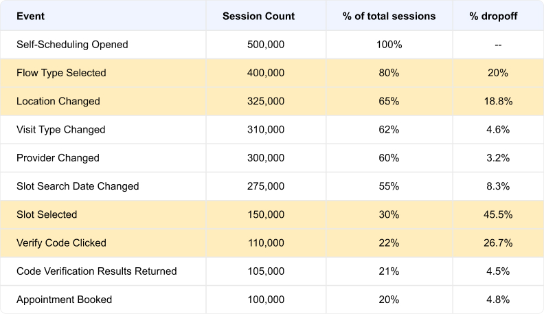
Data points taken from all self-scheduling sessions between December 2023 - January 2024.
Data points taken from all self-scheduling sessions between December 2023 - January 2024.
REVIEWING PAST RESEARCH DATA
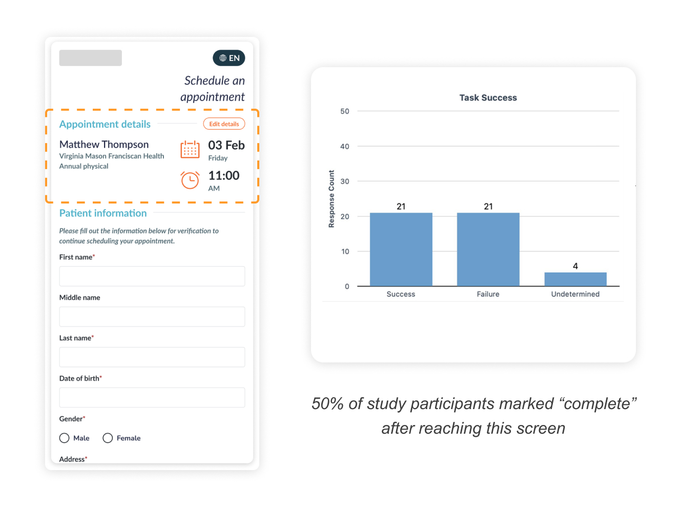
I also found past study that revealed a "false completion" issue where 50% of participants believed they had completed their appointment scheduling after the 'Slot Selected' step. The problem stemmed from how appointment details were laid out on the screen.
I also found past study that revealed a "false completion" issue where 50% of participants believed they had completed their appointment scheduling after the 'Slot Selected' step. The problem stemmed from how appointment details were laid out on the screen.
LAYING OUT THE WORKFLOW FRAMEWORK
Visualizing the task flow to help identify problem areas and aligning the team on opportunities we should focus on.
Visualizing the task flow to help identify problem areas and aligning the team on opportunities we should focus on.

THE DESIGN PROCESS
In accordance to our business goals, we focused on adapting small but impactful change throughout the workflow.
In accordance to our business goals, we focused on adapting small but impactful change throughout the workflow.
Providing clear indicators (45.5% drop-off)
Providing clear indicators (45.5% drop-off)
When I first looked into how self-scheduling worked on practice websites, we saw that appointment schedule times took an average of 10-15 seconds to load. In addition, our then loading screen was only a basic loading animation. This led to user uncertainty as to whether the system was working.
When I first looked into how self-scheduling worked on practice websites, we saw that appointment schedule times took an average of 10-15 seconds to load. In addition, our then loading screen was only a basic loading animation. This led to user uncertainty as to whether the system was working.
We first had our dev team look into shortening loading times, which helped us knock off a few seconds. I then took to UX best (loading) practices by implementing a dynamic message system and animation to reassure users the system was working and to give the perception of a shorter wait time.
We first had our dev team look into shortening loading times, which helped us knock off a few seconds. I then took to UX best (loading) practices by implementing a dynamic message system and animation to reassure users the system was working and to give the perception of a shorter wait time.

A total of 7 rotating messages with 3 second time frames per message which accounted for load times of up to 20 seconds.
A total of 7 rotating messages with 3 second time frames per message which accounted for load times of up to 20 seconds.
Improving visibility (45.5% drop-off)
Improving visibility (45.5% drop-off)
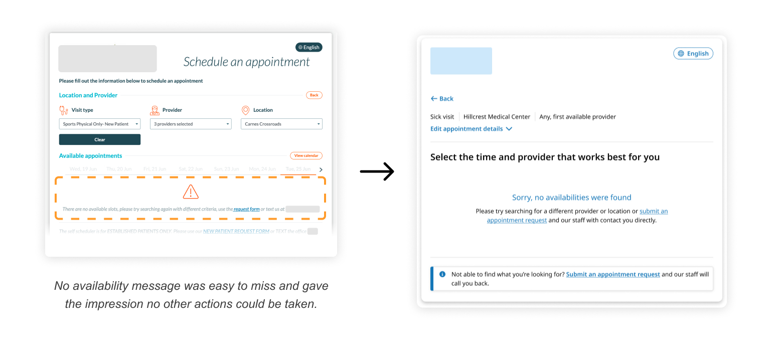
Our unmoderated usability test/interview showed patients were often confused on how to move forward when met with the 'No available appointments' screen. To reduce confusion and provide patients with clear follow-up actions, I implemented the following changes:
Our unmoderated usability test/interview showed patients were often confused on how to move forward when met with the 'No available appointments' screen. To reduce confusion and provide patients with clear follow-up actions, I implemented the following changes:
- Provided concise and clear messagine for blocker
- Followed best practice for internal link presentation
- Improved visibility and accessibility using larger text and color, and consistent information hierarchy
- Provided concise and clear messagine for blocker
- Followed best practice for internal link presentation
- Improved visibility and accessibility using larger text and color, and consistent information hierarchy
Simplifying the selection process (45.5% drop-off)
Simplifying the selection process (45.5% drop-off)
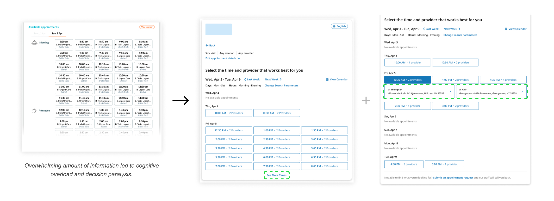
Our appointment selection screen was cramped and overwhelming. Usability testing of the past design revealed users had a difficult time reading and identifying appointment options.
Our appointment selection screen was cramped and overwhelming. Usability testing of the past design revealed users had a difficult time reading and identifying appointment options.
To address this problem, I started by utilizing more modern and accessible versions of the selection components, which enabled us to include additional information regarding the time slots, number of providers, and detailed addresses.
To address this problem, I started by utilizing more modern and accessible versions of the selection components, which enabled us to include additional information regarding the time slots, number of providers, and detailed addresses.
Although these changes required additional clicks and scrolling by the user, the reduced cognitive load made it easier and faster for users to view the appointments slots. This was confirmed via 2 rounds of A/B usability testing - which revealed a faster selection process (~4 second) and higher user satisfaction rate (92%) when comparing the before and after experiences.
Although these changes required additional clicks and scrolling by the user, the reduced cognitive load made it easier and faster for users to view the appointments slots. This was confirmed via 2 rounds of A/B usability testing - which revealed a faster selection process (~4 second) and higher user satisfaction rate (92%) when comparing the before and after experiences.
Eliminating "False Completions" (26.7% drop-off)
Eliminating "False Completions" (26.7% drop-off)
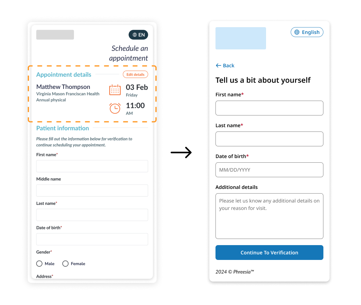
For the "false completion" issue, I found through additional usability testing that users took the top 'Appointment details' section as confirmation of their appointment. To fix this, I removed the details section. Follow-up usability tests resulted in 100% of participants successfully completed their scheduling workflow.
For the "false completion" issue, I found through additional usability testing that users took the top 'Appointment details' section as confirmation of their appointment. To fix this, I removed the details section. Follow-up usability tests resulted in 100% of participants successfully completed their scheduling workflow.
Recognition over recall (18.8% drop-off)
Recognition over recall (18.8% drop-off)
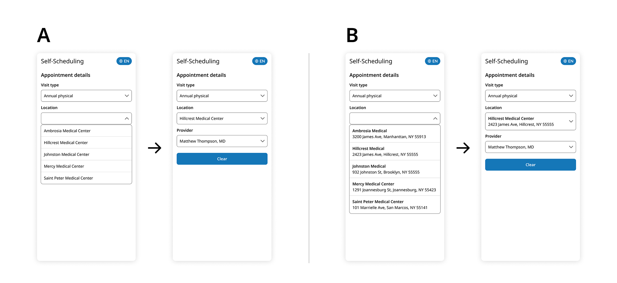
Our unmoderated usability test/interview showed patients would abandon scheduling when selecting their preferred practice location due to no address being shown. This had a much higher impact on new patients and newly returning patients.
Our unmoderated usability test/interview showed patients would abandon scheduling when selecting their preferred practice location due to no address being shown. This had a much higher impact on new patients and newly returning patients.
A simple update to include address alongside the practice name proved effective, with 93% of users opting for the address-included version.
A simple update to include address alongside the practice name proved effective, with 93% of users opting for the address-included version.
THE RESULTS
GAUGING EFFECTIVENESS
GAUGING EFFECTIVENESS
GAUGING EFFECTIVENESS
BETA TESTING
Prior to general access, we conducted a 8-week closed beta (March-April 2025) with 5 selected multi-location practices with the resulting outcomes:
Prior to general access, we conducted a 8-week closed beta (March-April 2025) with 5 selected multi-location practices with the resulting outcomes:
8% increase in schedule-through rate (~50,000 additional appointments)
2 new client sign-ups for self-scheduling within the first release
8% increase in schedule-through rate (~50,000 additional appointments)
2 new client sign-ups for self-scheduling within the first release
8% increase in schedule-through rate (~50,000 additional appointments)
2 new client sign-ups for self-scheduling within the first release
8% increase in schedule-through rate (~50,000 additional appointments)
2 new client sign-ups for self-scheduling within the first release
8% increase in schedule-through rate (~50,000 additional appointments)
2 new client sign-ups for self-scheduling within the first release
GENERAL ACCESS
Since the official launch (5 months as of October 2025) of the improved self-scheduling experience we've seen an average of 6-12% increase in scheduled-through rates across all of the practices that have the tool enabled.
Since the official launch (5 months as of October 2025) of the improved self-scheduling experience we've seen an average of 6-12% increase in scheduled-through rates across all of the practices that have the tool enabled.
"The new self-scheduling look and experience makes (Phreesia) feel more up-to-date with what competitors offer and our customers are taking well to it."
"The new self-scheduling look and experience makes (Phreesia) feel more up-to-date with what competitors offer and our customers are taking well to it."
"We love the updates and glad it wasn't a huge change so that our (practice's) team and patients didn't have to relearn anything."
"The new self-scheduling look and experience makes (Phreesia) feel more up-to-date with what competitors offer and our customers are taking well to it."
"We love the updates and glad it wasn't a huge change so that our (practice's) team and patients didn't have to relearn anything."
WHAT'S NEXT?
Our UX and product teams will continue monitoring schedule-through and drop-off rates across existing and newly onboarded clients, while expanding research through additional patient and practice outreach and AI-driven synthetic testing. We aim to track both positive and negative trends and identify relevant solutions to further reduce drop-off and increase schedule-through rates.
The 'Verify Code Clicked' phase of the scheduling experience is one area that we'd prioritize once we pick up the project again. This area fell out-of-scope due to multiple legal and technical blockers that we didn't have the time or technology to address at the time.
LESSONS LEARNED
Understanding what's doable
Throughout the project, I was reminded of how critical it was to identify technical constraints early; especially when keeping scope creep from derailing the launch. There were several UX improvements I knew would successfully reduce dropoff rates, but they required heavy engineering effort. The lack of awareness led to wasted time ideating and pushing for solutions that weren't within scope.
For this project, that meant being more disciplined about defining scope and understanding development requirements earlier on. We made deliberate choices about what needed to ship now versus what could become part of a future phase. Breaking a large redesign into sequenced, purposeful releases helped the team stay focused on the highest-impact issues while still giving us room to learn and adjust.
Now that the updated self-scheduling tool is live, we’re able to see how those compromises played out. The early metrics and client feedback are giving us a clearer picture of where to iterate next; validating some assumptions, challenging others, and giving us momentum for the next phase of improvements.